Blog

Pantone Releases the color of 2018:
Ultra Violet

A dramatically provocative and thoughtful purple shade, PANTONE 18-3838 Ultra Violet communicates originality, ingenuity, and visionary thinking that points us toward the future.


Complex and contemplative, Ultra Violet suggests the mysteries of the cosmos, the intrigue of what lies ahead, and the discoveries beyond where we are now. The vast and limitless night sky is symbolic of what is possible and continues to inspire the desire to pursue a world beyond our own.

Enigmatic purples have also long been symbolic of counterculture, unconventionality, and artistic brilliance. Musical icons Prince, David Bowie, and Jimi Hendrix brought shades of Ultra Violet to the forefront of western pop culture as personal expressions of individuality. Nuanced and full of emotion, the depth of PANTONE 18-3838 Ultra Violet symbolizes experimentation and non-conformity, spurring individuals to imagine their unique mark on the world, and push boundaries through creative outlets.

Historically, there has been a mystical or spiritual quality attached to Ultra Violet. The color is often associated with mindfulness practices, which offer a higher ground to those seeking refuge from today’s over-stimulated world. The use of purple-toned lighting in meditation spaces and other gathering places

For more about Greenery and its color pairing please visit Pantone.

PCB3 Wins 3 A.V.I.A. Communicator Awards!

This must be the year of the “3.” We are pleased to learn that PCB3 has won 3 Communicator Awards by the Academy of Interactive & Visual Arts. It is truly rewarding to be recognized from your peers in the industry.The Academy of Interactive & Visual Arts is an assembly of leading professionals from various disciplines of the visual arts dedicated to embracing progress and the evolving nature of traditional and interactive media. The Communicator Awards is a AVIA sanctioned competition that recognizes excellence in marketing and communications.

Our awards represent excellence in:

Campaign Logo: 2017 APA Summit on High SchoolPsychology Education Logo

Corporate Publications: 2017 APA Work, Stress, and Health Call for Proposals

Marketing & Promotion: IPsyNet Net LGBTI Concerns

For more information about theAcademy of Interactive & Visual Arts as well as the Communicator Awards please visit www.avia.org.

Pantone Releases the color of 2017:
Greenery

A refreshing and revitalizing shade, Greenery is symbolic of new beginnings.

Greenery is a fresh and zesty yellow-green shade that evokes the first days of spring when nature’s greens revive, restore and renew. Illustrative of flourishing foliage and the lushness of the great outdoors, the fortifying attributes of Greenery signals consumers to take a deep breath, oxygenate and reinvigorate.

Greenery is nature’s neutral. The more submerged people are in modern life, the greater their innate craving to immerse themselves in the physical beauty and inherent unity of the natural world. This shift is reflected by the proliferation of all things expressive of Greenery in daily lives through urban planning, architecture, lifestyle and design choices globally. A constant on the periphery, Greenery is now being pulled to the forefront – it is an omnipresent hue around the world.
A life-affirming shade, Greenery is also emblematic of the pursuit of personal passions and vitality.

According to Leatrice Eiseman, Executive Director of the Pantone Color Institute, Greenery “bursts forth in 2017 to provide us with the reassurance we yearn for amid a tumultuous social and political environment Satisfying our growing desire to rejuvenate and revitalize, Greenery symbolized the reconnection we seek with nature, one another and a larger purpose.”

For more about Greenery and its color pairing please visit Pantone

Duke Magazine: The First “Playboy”
for Black Americans

The good news for those who read Playboy for its articles is that those pesky porn pics are now gone. The bad news, of course, is: no more cartoons! A 62-year heritage that saw the likes of Jack Cole, Shel Silverstein, Harvey Kurtzman, and Gahan Wilson is no more, as the ranks of mass magazine feature illustrations continue to dissipate. Still, thanks the numerous imitators, Hef’s bunny did leave a litter of literary and graphic sophistication from back in its heyday. Take the short-lived Duke, the first such “men’s magazine” that was marketed specifically to black Americans.

Like Playboy, Duke Magazine operated out of Chicago. Begun in 1957, it sported a mascot: a button-eyed fashion mannequin, and a nude centerfold: the Duchess of the Month. Its art director, LeRoy Winbush, was posthumously awarded an AIGA Medal in 2008. For its debut photojournalist Archie Leiberman contributed snazzy features on Sammy Davis, Jr. and the Joe Lewis Boxing Gym. The standard gag cartoons of cuckolded husbands and promiscuous bimbos included two standouts by “McCartney,” the alias of Bill Ward, infamous for his risqué renderings of women with big-breasts, seamed stockings, and glittery garters.

The level of writing in that first issue ranged from a think piece about men’s preferences in “bosoms versus bottoms” to quality fiction from Langston Hughes, Erskine Caldwell, and Chester Himes as well as a Ray Bradbury sci-fi tale titled “The Last White Man.” Among the accomplished feature illustrations, I was particularly transfixed by a stunningly haunting woodcut for William Fisher’s “Daddy-o, That’s Me.” It was by the African-American artist and printmaker Eldzier Cortor.


Duke_cover

artist: Bill Ward

artist: Bill Ward

artist: Bill Ward

artist: Bill Ward

Duke_PaulPinson-600

artist: Paul Pinson | Click to Enlarge

artist: Bill Neebe

artist: Bill Neebe | Click to enlarge

artist: Dan Seculin
Read more at Print Magazine.

MIT Media Lab’s Journal of Design and Science Is a Radical New Kind of Publication

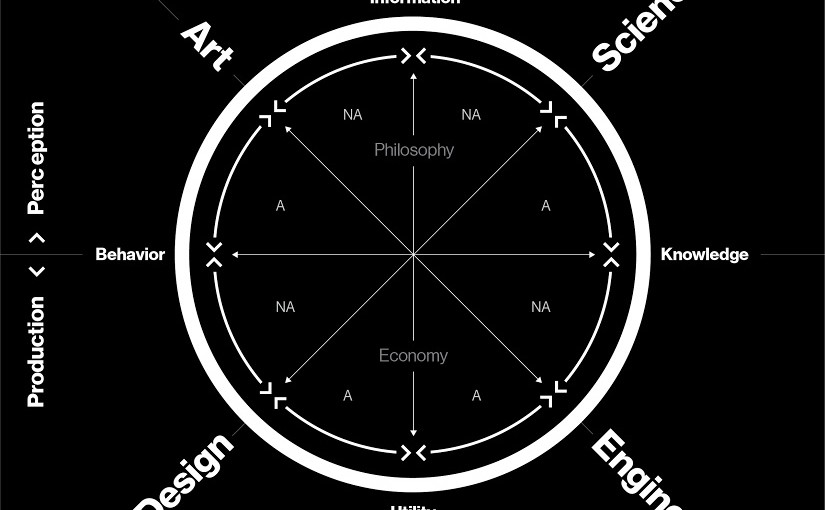
LAST FALL JOI Ito, the director of the MIT Media Lab, stood onstage during the Lab’s 30th anniversary celebration and made a declaration. “Connecting science and design is the future of the Media Lab,” he told audience members, many of whom are experienced in both disciplines. The subtext of Ito’s statement was that the world is quickly changing. Science, design, art, and engineering, long considered their own areas of focus, are no longer domains to be explored in isolation, but together, in the hopes of expediting progress and discovery.

Ito’s announcement was very much in keeping with the Lab’s unorthodox approach to collaborative research. Since its inception in 1985, the Media Lab has embraced the ideals of antidisciplinary work, which is not the same thing as interdisciplinary work. As Ito himself describes it in the Journal of Design and Science (JoDS): “Interdisciplinary work is when people from different disciplines work together. But antidisciplinary is something very different; it’s about working in spaces that simply do not fit into any existing academic discipline—a specific field of study with its own particular words, frameworks, and methods.”

With that in mind, Ito and a team of Media Lab professors recently launched the JoDS as a way to explore and encourage antidisciplinary work coming out of its, and other institutions’, classrooms. The first edition features papers from Ito, Kevin Slavin, Neri Oxman, and Danny Hillis—pioneers in fields as disparate as AI, game design, and digital fabrication—all of which expound on the idea of interconnectedness between disciplines.

JoDS is run very differently from a traditional academic publication. There’s no anonymized peer-review process, and there’s no fee to access its contents. “We wondered what does an academic paper look like when it’s more about the conversation, and less about tombstones,” Ito says, referring to a quote from Stewart Brand that likens formal academic publishing to burying ideas like the dead. The journal is published on PubPub, a platform developed at MIT that is inclusive in ways that academia and academic publishing frequently aren’t; PubPub is an experiment in radical transparency, where almost every part of the journal is open and editable. Readers can annotate each paper, adding comments and context to what the author wrote. The editing history is visible to everyone, so authorship is no longer an opaque attribution. Hillis’ paper has executable code that can be lifted directly from the journal.

Ito describes the process as “peer-to-peer” review. The goal, he says, is for ideas presented in the journal to morph and evolve and become interconnected over time. “You can imagine that after a few weeks, all of the papers coming out on this journal are all referring to and quoting each other, so it looks like a network rather than a bunch of isolated papers,” he says. In this way, the journal seeks to incorporate voices from as many interested disciplines as possible. “The idea that going deep deep deep to get better results is giving way to the idea that the way to get the most interesting results is to be able to go a bit diagonal,” Slavin says. Both Slavin and Ito reference the field of synthetic biology as an example of where this intersection is happening, and point specifically to the work of Kevin Esvelt.

Pantone Releases the colors of 2016:
Rose Quartz and Serenity

A softer take on color for 2016: For the first time, the blending of two shades – Rose Quartz and Serenity are chosen as the PANTONE Color of the Year

As consumers seek mindfulness and well-being as an antidote to modern day stresses, welcoming colors that psychologically fulfill our yearning for reassurance and security are becoming more prominent. Joined together, Rose Quartz and Serenity demonstrate an inherent balance between a warmer embracing rose tone and the cooler tranquil blue, reflecting connection and wellness as well as a soothing sense of order and peace.

The prevalent combination of Rose Quartz and Serenity also challenges traditional perceptions of color association.

In many parts of the world we are experiencing a gender blur as it relates to fashion, which has in turn impacted color trends throughout all other areas of design. This more unilateral approach to color is coinciding with societal movements toward gender equality and fluidity, the consumer’s increased comfort with using color as a form of expression, a generation that has less concern about being typecast or judged and an open exchange of digital information that has opened our eyes to different approaches to color usage.